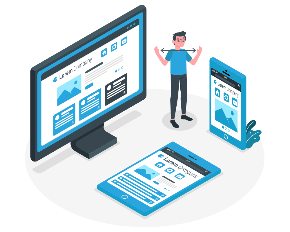
Powerfully responsive
Today, for the past some years, mobile growth has blown up onto the scene. The progress of mobile Internet usage is also unusual comparing that normal Internet usage growth.
It is difficult to find someone who doesn’t have a mobile device, linked to the Internet. With the development in mobile Internet usage comes the question of how to develop websites applicable for all users. The industry reacts to this question has become responsive web design, also known as RWD.
Responsive Web Design
Responsive web design is one of the applications of developing a website appropriate to work on all devices and all screen sizes, no issue on how large or small, mobile, or desktop. Responsive web design is concentrated around giving an instinctive and satisfying experience for all. Desktop computers and mobile phone users are satisfied with responsive websites.
The application Responsive web design, well defined by Ethan Marcotte in a list apart reacts to the requirements of the users and the devices they’re using. The design transitions depend on the screen size and effectiveness of the device. For example, on a phone, the customers will view the matter displayed in a single column view, a tablet might show the same matter in two columns.
DSSI MLM software solutions provide you the powerfully responsive web designing facilities. The main UI feature of our MLM Software is that it is fully responsive. Using the latest technologies in front-end development, we have managed to give it a stunning look across all screen sizes. The software fitted to all screens. DSSI MLM software is purely responsive and it feels good in all devices.
Types of responsive web design
Responsive web design is divided into three main elements, like flexible layouts, media queries, and flexible media.
Flexible Layouts
flexible layouts is one of the methods of developing the design of a website with a responsive framework, suitable for dynamically resizing to any width. The responsive frameworks are made using relative length units, most commonly percentages or em units. These applicable lengths are then used to inform general framework property values such as width, margin, or lining.
Media Queries
Media query is a CSS module introduced in CSS 3 supporting content analysis to change to settings such as screen resolution (e.g. smartphone screen vs. computer screen). The primary aptitude might be to select media queries to build a responsive site. Though, the difficulty one faces with media queries is that new queries can develop from moment to moment; every time, the customer experiences quick and harsh changes to the look and system of the site.
Flexible media
Flexible media is the central point of the content like Facebook, Flickr, Instagram, YouTube, etc and it adds weight to the point of the page and it helps convey the page content purpose